
Stripes, dots, shapes : How to mix patterns like a pro
stories
How to mix patterns like a Pro: So you were lucky enough to travel to Kashmir this summer and brought back those gorgeous cushions decorated with traditional patterns? Now you’d like to set them up in your living room to create an exotic atmosphere. Yet, you’re not too sure it would fit with your existing decor ? This article will provide you with everything you need to know to integrate patterns and prints in your home design, whether you brought them from the other side of the world or your favorite local decor shop.
Determine the atmosphere you want to create
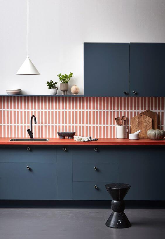
Warm and feminine living room, graphic bathroom? Before you start working with patterns, you will need to determine what kind of atmosphere you wish to create. For instance, florals will help you create a warm and relaxing setting. Graphic patterns on the other hand make for a rather contemporary interior.
Choose A Main Pattern
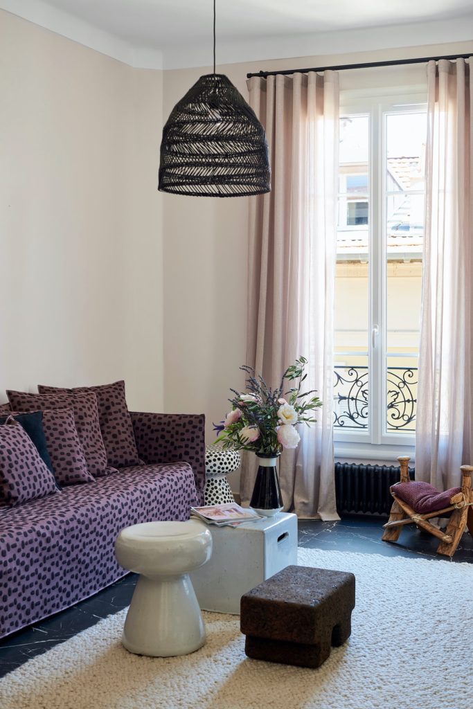
Once you have decided what type of atmosphere you will be creating, you can easily choose the type of pattern you will be working with. First, pick a dominant one and start designing around it. Then choose secondary patterns and fabric. The dominant pattern will make up for the majority of the prints while the secondary one will be about 50% less. According to the general rule, you should choose at least three different patterns for a room. Herringbone, stripes and paisley or stripes, floral and polka dots for instance.
Choose Patterns In Harmonious Colours
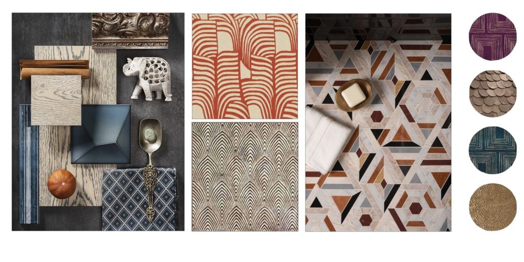
Just like learning to mix and match colours will help you create the perfect interior decor, the rule applies to the colour of your patterns as well. Thus, as you choose the patterns you will be designing with, keep in mind the colour wheel and pick them according to it:
- Primary colours : Red, Yellow and Blue.
- Secondary colours are the colors that can be made by mixing two primary colours together : Green, Orange and Purple
- Tertiary colours are the six shades that can be made from mixing primary and secondary colours.
Thus when picking your patterns you can apply the colour matching rules following either that of analogous combination, using three colours that sit next to each other on the colour wheel or complementary combination, using colours that sit on the opposite on the colour wheel. Yet, in order to create a harmonious colour combination, it is best to go for analogous combination. For more on the topic of colour matching go to this article or get in touch with one of our professional interior designers.
Pick An Accent Colour
Now that you have chosen your patterns in harmonious colours you might want to add a colour that pops and gives your room a more dynamic result. If you’ve gone with the analogous colour combination, you can either pick an accent colour that sits either on the opposite of the colour wheel or on the extreme end of the shade scale. This will not only round up the end result but it will also bring more light onto the patterns and make them stand out in contrast.
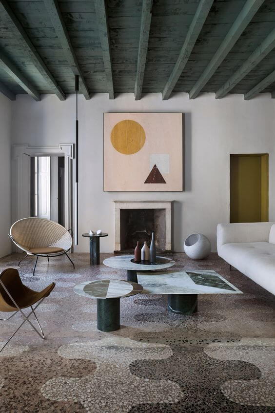
Vary the Scale of Your Patterns
Mixing up the scale of your patterns consists in picking different sizes of the same three patterns you’re working with. It can be big, medium and small or two medium sizes and a big one. If working with animal prints for example, varying the scale of your patterns will add personality and create a decor that will be remembered. Yet you can choose one big pattern for one wall and smaller ones for accessories. As for colours, once you know the rules you can play with them and express your own personality through your home decor.
Distribute patterns evenly throughout the room
Whether you work with animal prints or florals, if you think of your room as a pie chart, the main bold print should make up for 60% (wallpaper for instance) then 20% smaller prints and designs (let’s say cushions and pillowcases) and the remaining 10-15% can be plains.
Balance the whole by adding plains
Once you have picked and matched your patterns, plains will be very useful to balance them out and create a harmonious yet striking result. Pick colours that match those of your patterns to create a balanced yet striking result or use neutrals for a more relaxed atmosphere. As you choose the plain colours to mix with your patterns, the rule of colour matching will still help you to achieve a professional-looking decor.
Following rules is a great way to get started with home decor, yet it should always remain fun and an outlet for your creativity to be expressed. Learning how to mix patterns is a breeze once you get the hang of it. You’ll find more inspiration as you explore our past projects or by getting in touch with one of our professional interior designers.