
The Strange History of Stripes: From Social Stigma to Interior Design Staple
From medieval controversy and maritime uniforms to haute couture, political flags and contemporary interiors, the stripe has accumulated a surprisingly complicated history. Its appeal lies partly in its simplicity, but its meanings have never been quite so straightforward.
Look around almost any home and you are likely to find a stripe somewhere. It might appear on curtains, an upholstered chair, a rug, bathroom tiles or the fabric of a striped awning outside a café. Sometimes it is so subtle that it registers as texture. Elsewhere, it becomes the defining feature of a room.
The stripe is one of the most enduring devices in decorative design. Depending on its scale, colour and surroundings, it can make an interior feel tailored, relaxed, formal, playful or theatrical. It works equally well on humble cotton and elaborate silk.
Its apparent simplicity conceals a complicated cultural history. Stripes have been associated with social exclusion, religious controversy, military service, political identity, fashionable refinement and artistic experimentation. They have marked people as outsiders while serving as emblems of belonging. They have organised space, decorated it and occasionally unsettled it.
Understanding the history of stripes means looking beyond their current reputation as a timeless pattern. It means asking how a few repeated lines acquired so many different meanings, and why they continue to hold our attention.
A pattern without a single point of origin
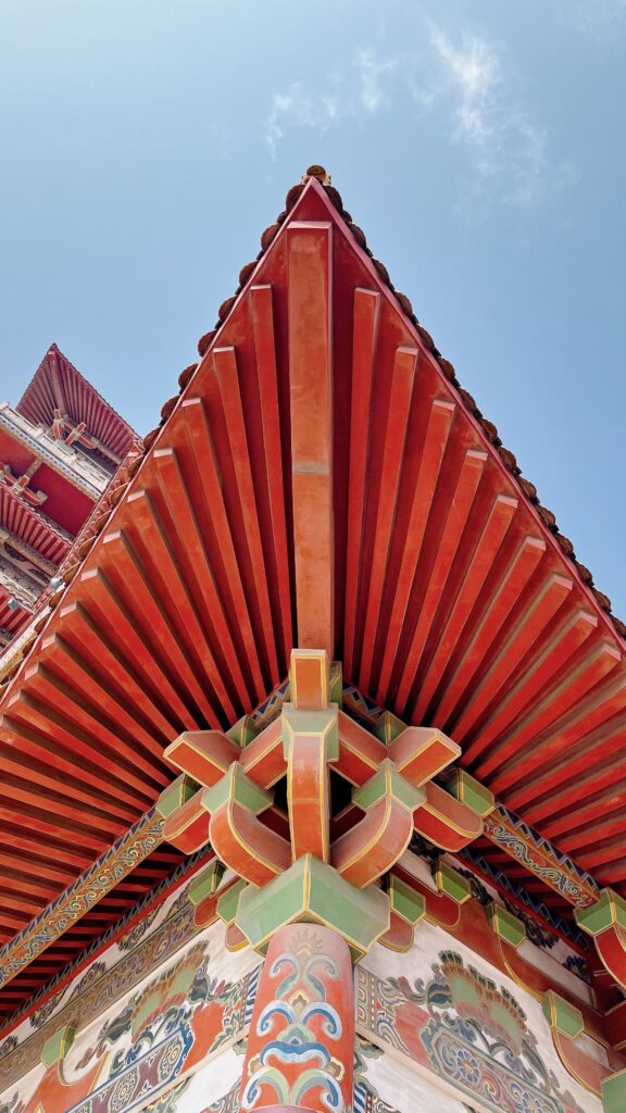
There is no single place or moment from which stripes spread around the world. Their basic construction makes them relatively straightforward to produce: a weaver can alternate coloured threads, while a dyer, embroiderer or painter can introduce bands of colour onto an existing surface. However, the resulting patterns developed within distinct cultural and technical traditions.
A textile in the collection of New York’s Metropolitan Museum of Art, for example, dates to China’s Eastern Zhou dynasty, during the Warring States period (475–221 BCE). Woven from silk, it combines red stripes with geometric motifs and confronted birds. The red dye was probably made from cinnabar, a mineral pigment. The textile demonstrates that stripes could form part of elaborate, high-value patterned cloth long before they became associated with the uniforms and fashions familiar today. View the textile at the Met.
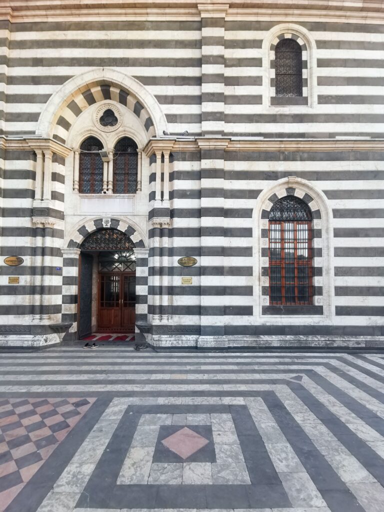
Centuries later, striped textiles were also important within Mamluk culture, which flourished across Egypt and Syria between 1250 and 1517. Mamluk garments included striped hats, trousers and cloaks, while architecture employed alternating bands of contrasting stone, a technique known as ablaq. Some woven silks incorporated inscriptions, flowers and geometric motifs within their stripes. The pattern could be sophisticated, prestigious and culturally specific. Read the Cooper Hewitt’s history of striped textiles.
West African weaving traditions offer another perspective. Among Asante weavers in present-day Ghana, textiles are constructed from narrow woven strips sewn together to form larger cloths. Kente, one of the best-known examples, uses combinations of bands and geometric patterns, with particular designs carrying names and associations. Kente has long been connected with identity, ceremony and social distinction.
These examples matter because stripes are often discussed as though they possess an inherent meaning. In reality, a sequence of parallel bands has no universal cultural message. A similar visual structure can signify prestige in one setting, practical utility in another and social exclusion somewhere else. The more revealing story begins when we examine who wore stripes, where they appeared and what societies chose to associate with them.
When stripes became suspect in medieval Europe
One of the strangest chapters in the history of stripes is their association with disorder and social transgression in medieval Western Europe. In The Devil’s Cloth: A History of Stripes and Striped Fabric, French historian Michel Pastoureau examines how striped garments appeared in medieval imagery on people and characters considered morally suspect, socially inferior or outside established conventions.
The stripe could appear unsettling because it divided a surface into competing bands. Rather than presenting an uninterrupted field of colour, it introduced visible contrasts that challenged the preference for clearly differentiated forms and backgrounds found in some medieval visual traditions.
In religious art and manuscripts, the Devil and Judas were sometimes depicted in striped clothing. Stripes also appeared in particular representations of entertainers, servants, prostitutes and other people occupying marginal social positions.
A revealing episode involved the Carmelite religious order, which originated in the Holy Land. The Carmelites wore habits that included stripes, and their arrival in Western Europe prompted controversy. Their clothing became a source of religious dispute and ridicule, making a visual pattern an unexpected obstacle to the authority they sought to establish.
Yet stripes were not universally condemned. In heraldry, coloured bands could identify respected families, territories and political allegiances. The red and yellow bands associated with the Crown of Aragon, for instance, represented dynastic identity rather than disgrace.
The contradiction is important. The same basic pattern could identify a prestigious lineage in one context and a disreputable character in another. Meaning depended on the person wearing it, the society interpreting it and the circumstances in which it appeared. This is one reason stripes make such an interesting subject for design history. Their significance does not reside solely in their shape. It emerges from the social rules surrounding them.
From the margins to the fashionable interior
By the early modern period, stripes were increasingly visible across European dress and decorative arts. The pattern moved between social settings, acquiring new associations as tastes changed.
Eighteenth-century clothing provides a useful example. A French silk robe à la française dating from 1765–70 in the Metropolitan Museum of Art’s collection features striped fabric that the museum associates with the development of Neoclassical taste. Compared with the elaborate floral silks of preceding decades, stripes introduced a clearer geometric structure while retaining the sheen and expense expected of fashionable dress. View the dress at the Met.
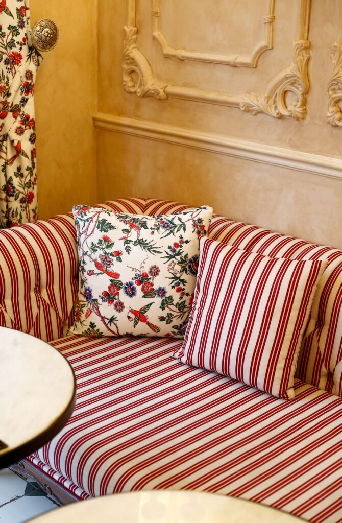
The stripe gave the surface order, but the material remained rich. It could look restrained from a distance while rewarding closer inspection. This flexibility helps explain the pattern’s place in interiors. Striped fabrics have been used for upholstery, curtains, bed coverings and other domestic textiles. Some are narrow and regular, resembling a woven texture. Others alternate broad fields of colour, making the fabric a conspicuous feature of the room.
Domestic utility has its own striped tradition. Mattress ticking, for example, traditionally used closely spaced stripes as part of a durable woven covering. Awning fabrics developed another visual language, with coloured bands appearing across shopfronts, terraces, markets and cafés. There is also a distinction between decoration and construction. A stripe printed onto a surface is different from one produced by alternating the threads of a woven textile. In the latter, the pattern belongs to the making of the object itself.
Material changes its character, too. A narrow stripe woven into wool looks different from one printed on cotton or painted across a plastered wall. The width of the bands, the quality of the weave, the depth of the colour and the way a surface catches light all influence the result. The stripe may be simple in outline, but its expression through materials is remarkably varied.
The revolutionary stripe
During the eighteenth century, stripes acquired a powerful political dimension. Bands of colour became a way of representing collective identity and new ideas about citizenship.
The American flag offers a clear example. Established by congressional resolution in 1777, its original design included thirteen alternating red and white stripes representing the thirteen original colonies. A simple sequence of bands became a national emblem. Explore the history of the Stars and Stripes.
The French Revolution introduced its own powerful arrangement of colour through the blue, white and red tricolour. Although the French flag uses vertical rather than horizontal bands, it belongs to the same broader story: distinct fields of colour became a way to represent a new political order and a collective identity.
This was a striking reversal of the disorder associated with stripes in some medieval European contexts. A pattern capable of marking social difference could now communicate unity and belonging.
The principle continues today. Flags, uniforms and institutional branding use repeated bands to establish recognition. Their simplicity allows them to remain legible at a distance, where fine detail would be lost.
In an interior, a similar principle operates on a smaller scale. A striped floor or upholstered piece can establish a visual framework for the objects around it. The pattern suggests alignment and sequence, although the effect depends on its proportions and colours.
The stripe’s political history reminds us that patterns are rarely separate from the systems that use them. Repeated often enough, a visual arrangement can become so familiar that it seems natural, even when its associations were created by specific historical circumstances.
How the sailor’s shirt became an icon of French style

Few garments have contributed more to the modern image of stripes than the French marinière, the blue-and-white jersey traditionally associated with sailors. Its formal place in the French Navy dates to a regulation of 27 March 1858, which standardised the knitted shirt worn by sailors. The arrangement of bands made the garment part of a recognisable naval identity.
A popular story claims that its twenty-one stripes represented Napoleon’s victories. Another suggests that the pattern was designed to make sailors easier to spot if they fell overboard. Both explanations are frequently repeated in fashion writing, but neither should be treated as established by the uniform regulation itself. The documented history of the garment is more securely rooted in maritime workwear and the standardisation of naval clothing. Read Orcival’s history of the marinière.
Its transition into fashion occurred during a wider transformation in women’s dress. In the early twentieth century, sportswear, practical garments and looser silhouettes challenged the restrictions of formal clothing. Coco Chanel helped adapt maritime styles for civilian wear. Associated with the French seaside resort of Deauville, her early fashion work drew on jersey and the relaxed clothing of coastal life. The sailor’s stripe became part of a wardrobe that was more informal in appearance and less dependent on established conventions of dress.
Chanel did not invent the stripe, nor was she the only designer exploring practical clothing. Her significance lies in helping reposition a working garment within fashionable civilian life.
Film and celebrity culture extended its reach. Jean Seberg’s striped top in Jean-Luc Godard’s À bout de souffle (1960) became closely associated with the film’s image of youthful Parisian style. Later, Jean Paul Gaultier repeatedly revisited sailor imagery and the marinière in his collections.
The garment became shorthand for a particular idea of French style, especially when interpreted by international fashion media. It could be worn with denim, tailoring or skirts while remaining recognisable.
There is an irony in this transformation. The maritime stripe acquired an aura of effortlessness through its accumulated associations with French fashion, artistic life and seaside leisure. A garment designed for practical use became a cultural signifier.
Stripes, status and the language of uniforms
The stripe’s fashionable reputation has never erased its associations with authority, hierarchy and social control. In menswear, the pinstripe became closely associated with business tailoring and financial institutions. Fine lines on a dark suit could suggest discipline, formality and professional status. Elsewhere, more conspicuous stripes acquired different associations through popular culture, from entertainers to fictional gangsters.
Uniforms reveal this ambiguity particularly clearly. Stripes can identify a profession, distinguish one group from another or make a person immediately recognisable. Their usefulness comes partly from the speed with which they can be read. Striped prison clothing became a familiar visual shorthand for incarceration. During the twentieth century, images of Nazi concentration camp prisoners also gave striped uniforms a particularly grave historical significance. Clothing varied according to historical circumstances, but the association became embedded in photographs, testimony, memorials and subsequent representations in film and literature.
The familiar cartoon prisoner in a striped outfit draws on this visual convention, although the simplified image can conceal the harsher history behind it. The relationship between stripes and power is not always negative. Naval uniforms, business suits and ceremonial garments can confer status or authority. What matters is who controls the image and what the garment is intended to communicate. Fashion has repeatedly demonstrated how quickly these associations can change. A visual sign that once imposed a category can be reclaimed as an expression of identity, humour or resistance. The stripe’s history is therefore also a history of changing attitudes towards the people who wear it.
What stripes do to an interior
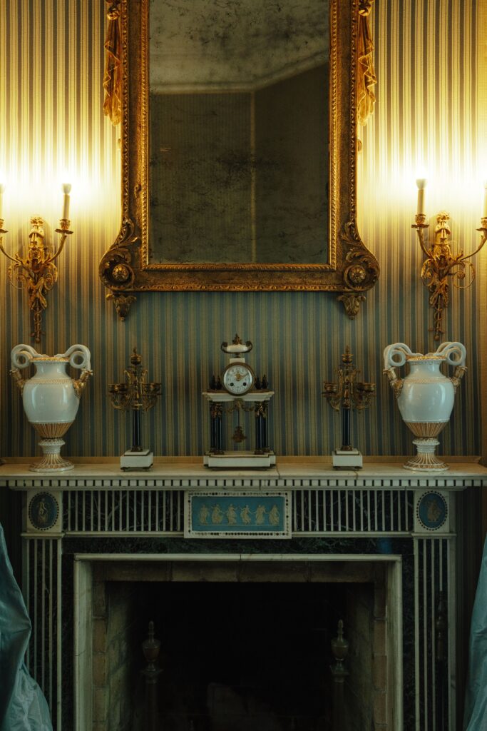
The stripe’s longevity in interior design is partly a consequence of its visual qualities. Unlike a floral, animal or figurative motif, it works primarily through repetition and direction. It establishes rhythm across a surface and draws the eye along an axis.
This makes stripes particularly effective in interiors, where architecture already provides a framework of lines. Windows, doorframes, floorboards, staircases and furniture establish horizontal and vertical relationships. Stripes can reinforce those relationships or introduce a competing rhythm.
Consider the difference between fine pinstriped curtains and fabric with broad, high-contrast bands. The first may register almost as texture when seen across a room. The second establishes a stronger visual presence and can become a defining element of the scheme. The same distinction applies to upholstery. A narrow stripe on an armchair may emphasise its silhouette and suggest a tailored appearance. A broad stripe on a sofa can make the furniture feel graphic and contemporary. An irregular stripe woven into natural fibres may introduce a softer, more organic character.
Orientation matters, although not according to the simple rules often repeated in decorating advice. Vertical stripes can draw attention to height, while horizontal bands can reinforce width or establish connections across a room. The outcome depends on the width and spacing of the lines, their contrast with the background, the dimensions of the surface and the surrounding architecture.
A striped rug might direct attention towards a window or doorway. A striped wall could emphasise the height of a room, while repeating a pattern across curtains and upholstery might create continuity or, if the scales compete, visual confusion. The architectural setting is as important as the pattern itself. Stripes are often most effective when they respond to something about the room: its proportions, its windows, its materials or the relationship between solid and open space. They can provide visual discipline, but they can also create movement. Few decorative patterns are quite so adaptable.
The psychology of repetition
Why does the pattern remain so appealing?
Part of the answer lies in how we process repeated visual information. Stripes establish a predictable sequence, but they can also create tension when the bands are closely spaced, sharply contrasting or arranged in ways that challenge our perception of depth and movement.
The Optical Art movement demonstrated this particularly well. Bridget Riley’s Current (1964), in the collection of New York’s Museum of Modern Art, uses repeated lines to create an impression of vibration and three-dimensional depth. The painting remains a flat surface, yet the eye experiences movement through the interaction of its elements. View Current at MoMA.
Domestic stripes rarely produce such an intense response, but the underlying principle remains useful. Low-contrast bands may sit quietly within an interior, while sharp contrasts become visually dominant. Changing the width, spacing or colour of the bands alters the effect.
Regular stripes provide a sense of order because the eye can follow the sequence. If the spacing changes or the colours alternate unexpectedly, the pattern becomes more dynamic. Depending on the context, it may feel playful, energetic or unsettling.
Do horizontal stripes really make things look wider?
One of the most persistent beliefs about stripes concerns their effect on body shape. Horizontal stripes are commonly said to make the wearer look wider, while vertical stripes are supposed to have the opposite effect. Research suggests that this rule is far less reliable than popular advice implies.
In a 2011 paper published in i-Perception, psychologists Peter Thompson and Kyriaki Mikellidou examined the so-called Helmholtz illusion and tested the belief that horizontal stripes make people appear fatter. Their experiments found that shapes containing horizontal lines could appear taller and narrower than comparable shapes containing vertical lines. Their clothing-image experiments also failed to support the conventional claim that horizontal stripes necessarily make the wearer look wider.
The findings demonstrate that visual perception is more complicated than a simple rule about direction. Results depend on the shape being viewed, the arrangement of lines and the surrounding context. Read the research paper. The same caution applies to interiors. Stripes can influence how we perceive a surface, but they are not a universal shortcut for correcting proportions. Their effect depends on composition, scale and contrast.
From the home to the public realm
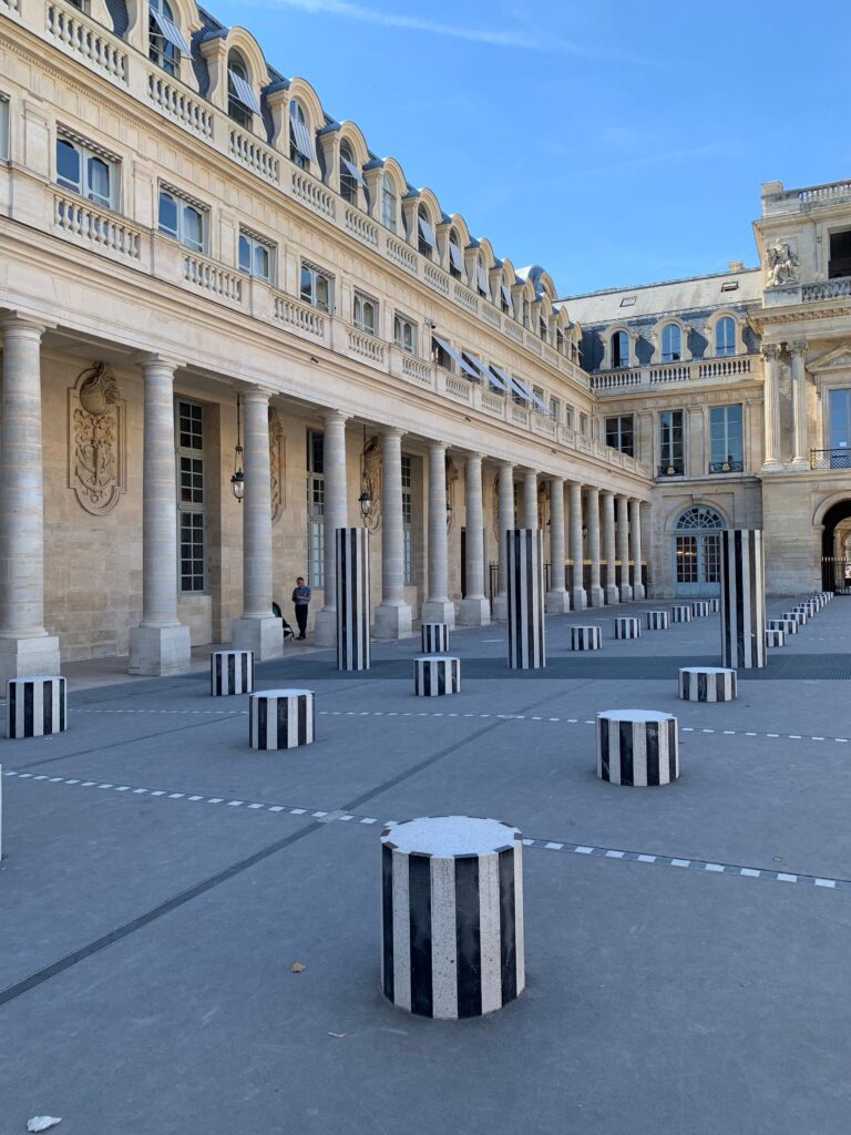
Stripes are especially effective in public environments because they remain legible at a distance. Road markings, warning signs, sports uniforms and commercial awnings use repeated bands to communicate quickly.
The British zebra crossing offers a familiar example. Crossings were introduced in the UK during the 1930s, and the recognisable black-and-white stripes were added in 1949 to improve visibility. The design became so familiar that it gave the crossing its name.
The pattern subsequently became an icon of popular culture through the Beatles’ 1969 Abbey Road album cover. What began as a functional road marking became a globally recognised image, demonstrating how public design can acquire cultural meaning far beyond its original purpose. Historic England’s listing of the Abbey Road crossing provides further context.
French artist Daniel Buren explored a related idea through his use of commercially available striped awning fabric. Beginning in the 1960s, he used alternating coloured and white bands to draw attention to the places where his work appeared, including galleries, shop windows and urban spaces.
Rather than treating the stripe as a decorative motif, Buren used it to prompt questions about art, architecture and the context in which we view objects. The pattern became a means of directing attention towards its surroundings.
This has an interesting relationship with interior design. Commercial awning fabric is ordinarily intended to shade a window or terrace. In Buren’s work, the same material becomes an artistic device. What changes is not necessarily the stripe itself, but the setting and the way it asks us to look.
Why stripes endure in contemporary interiors
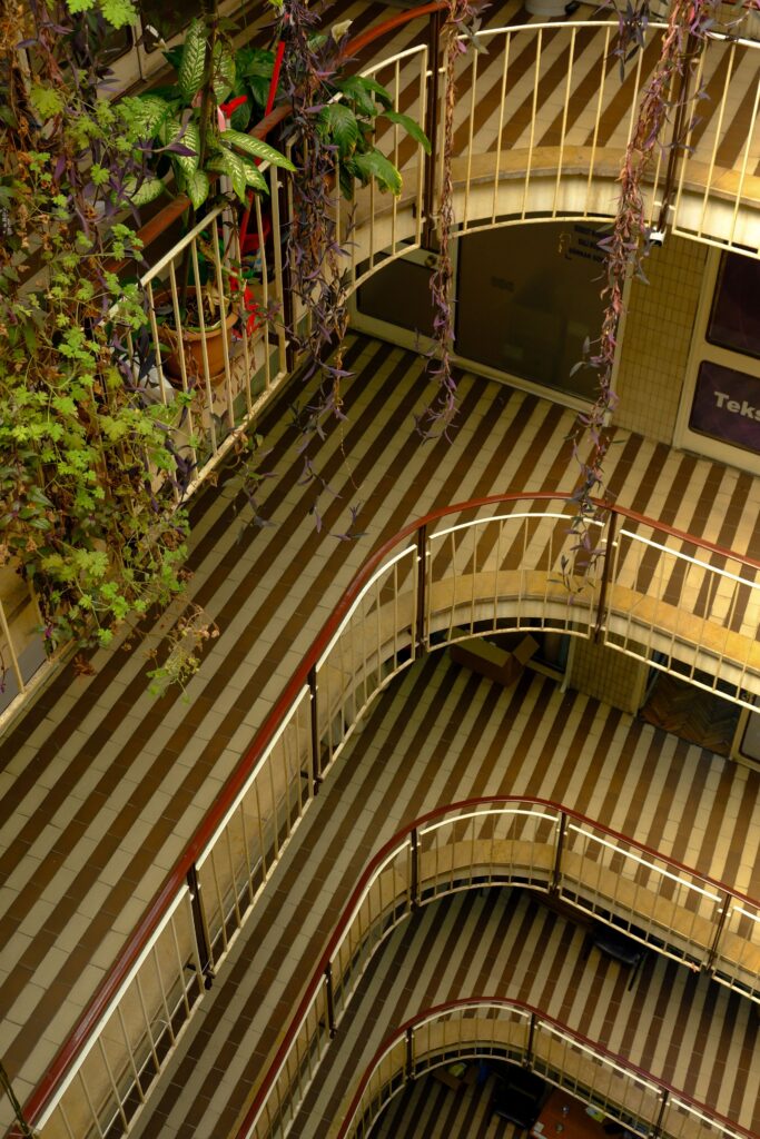
Contemporary designers continue to use stripes because they sit comfortably between architecture and decoration. They are more structured than many organic patterns, yet more expressive than a plain surface. A fine stripe on wool upholstery suggests something different from broad bands on a cotton sunshade. The former may feel tailored and understated; the latter can introduce a bolder, more graphic quality. Both rely on the same basic principle, but their materials, proportions and contexts determine the result.
Stripes can also connect different elements within a room. Repeated bands might link curtains to upholstery, echo the lines of a window or bring continuity to a scheme containing several materials. Equally, they can provide contrast against florals, checks, textured plaster, timber grain or sculptural furniture.
The most successful applications tend to be considered in relation to the architecture. A broad stripe needs sufficient space for its rhythm to register clearly. Fine bands may be more appropriate where the pattern should remain subtle. A stripe used on one chair or a small section of wall can introduce contrast without dominating the entire scheme.
Material choice remains central. A stripe woven into natural fabric may appear softer and less precise than one printed with sharp, uniform edges. The surface texture, the way it responds to light and the quality of its finish all influence how the pattern is experienced. This is where the history of stripes becomes relevant to contemporary design. The pattern is familiar, but its possibilities are broad. Its appeal comes from the relationship between order and variation, between the clarity of the line and the character of the material.
A pattern that keeps changing its meaning
The history of stripes demonstrates that even the simplest visual forms can carry complicated associations.
Across different periods and cultures, stripes have appeared in prestigious textiles, religious dress, domestic furnishings, naval uniforms, revolutionary flags, prison clothing, fashion collections, street markings and contemporary art. They have been used to distinguish people, unite them, identify them and draw attention to the spaces they occupy.
Their meanings have changed because their contexts have changed. A pattern associated with social exclusion in medieval European imagery could later become an expression of fashionable ease. A sailor’s working shirt could become a symbol of French style. A standard commercial fabric could become an artwork.
In interiors, the stripe remains valuable for much the same reason. It is immediately recognisable, yet difficult to exhaust. A small adjustment in proportion, contrast, material or orientation can transform its effect. Perhaps that is the most interesting thing about stripes. They appear to impose order, yet leave considerable room for interpretation. The lines remain simple. Everything around them changes.
To see more from us, our news stories and blog posts, follow the link HERE. Additionally, if you want to keep up to date with the progress on our projects you can follow us on Instagram. We regularly post updates on our international projects!