
Mix and match : Colour pairing for beginners
stories
Colour pairing; Choosing colours in interior design, why does it matter ? As much as space and light make how a space feels, colors act as a way to communicate emotions in a non-verbal manner. The shades you use for your interior design thus serve as a means of communication with whoever visits your house and will affect how they interpret the various spaces of your home. In this article you will learn the basics of colour combination as well as find some inspiration for colour combinations out of the beaten paths.
First of all, let’s take a look at the different types of colours, using the colour wheel :
- Primary colors are the building blocks of all the other colors on the wheel. They are Red, Yellow and Blue.
- Secondary colors are the colors that can be made by mixing two primary colours together : Green, Orange and Purple
- Tertiary colors are the six shades that can be made from mixing primary and secondary colors.
Color combination
Now let’s see what the different options of colour pairing there are :
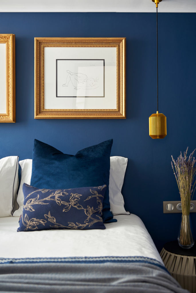
Analogous Combination
You can create an analogous colour pairing combination using three colours that sit next to each other on the colour wheel. To make sure the space is balanced in an analogous combination, make sure to follow the colour proportion rule of 60-30-10%. According to this rule, when using 3 colors in a space, the dominant color should represent 60%, while the two others should respectively represent 30 and 10%. Follow this rule and experiment with different combinations to create the coherent result you’re aiming for!
If you’d rather opt for a neutral look, you can choose to use semi-neutral shades. Blues and Greens for example, tend to be the most cooperative of colors. This rings even truer when choosing more neutral hues with a hint of grey. A semi-neutral combination can be made more dynamic using accents of colours that remain of the same shade as one of the three you have chosen to get started with. This will then enable you to create a neutral space and add the possibility to make it more striking if you ever decide to.
Complementary Combination
Complementary combination is the easiest color combination to create. It is created using two colours that sit opposite on the colour wheel. One of the two will act as the dominant colour while the other serves as an accent. This kind of combination is extremely high contrast and will thus bring a strong energy to the room. Better to save it for smaller spaces.
Colour-mapping
Colour-mapping applies once you have decided on your colour combination. It consists in pulling the colors throughout the space and essentially mapping the colors so that the colours you have selected in your combination are repeated throughout the room. Colour-mapping is a great way to make the whole space more cohesive and create a professional result.
Colour-mapping applies once you have decided on your colour combination. It consists in pulling the colors throughout the space and essentially mapping the colors so that the colours you have selected in your combination are repeated throughout the room. Colour-mapping is a great way to make the whole space more cohesive and create a professional result.
Some inspiration
Now that we’ve covered the basics of color combination, let’s see what happens if we break the rules a little.
Tone on Tone
Whether it is all white or all shades of blue, you might be tempted to go for an only colour combination. While white might be a great choice for a living room full of light, you might want to limit tone-on-tone choices of dark colours for spaces that aren’t too big or important. What’s more, tone on tone colour combinations are also an interesting way to play with the analogous color combination.
More Is More
More than the recommended two or three shades ? Sure, go for it, but go all-in and create a rather original interior with a rainbow-like colour combination. Yet if you do so, don’t forget to create still points with neutral shades, it will give your visitors’ eyes a rest. This will help create a more coherent result, even with numerous different shades.
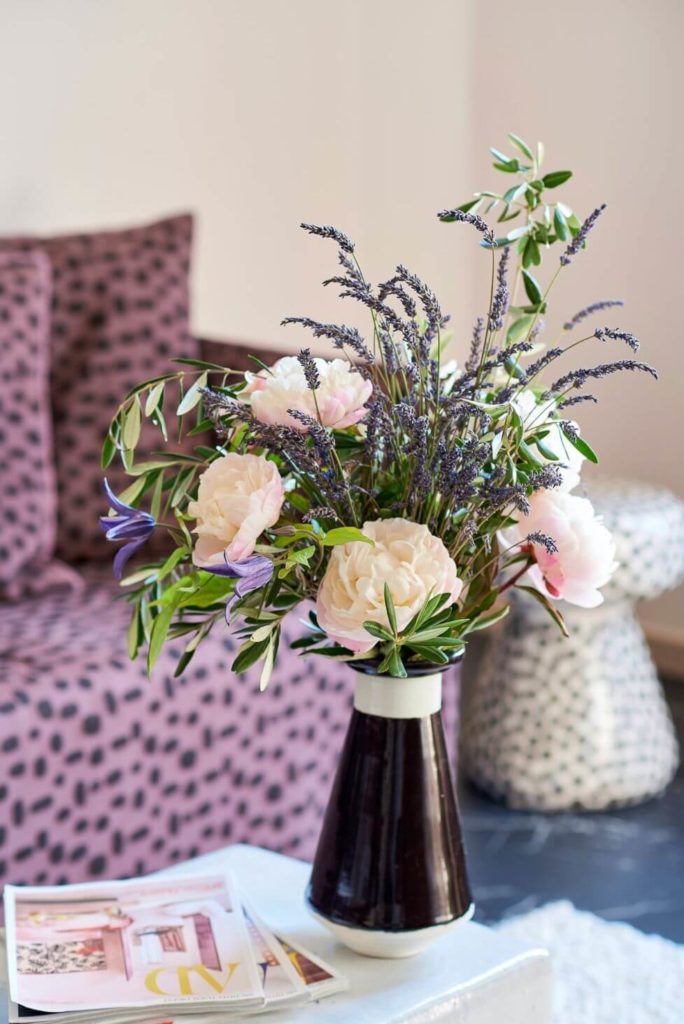
Patterns With Solids
Another way to play with the basic rules of colour combination is to mix patterns with solids. Even if you’d like to stick to the analogous or complementary combination, you can get loose with it by mixing patterns of one of your colours with solids of the others. If done well, this could give your interior an impression of a professional result. Yet, if you’re unsure of how to pick patterns and colour combinations, our professional interior designers are always happy to advise.
As well as patterns can help with colour pairing, using different textures is also a great way to add depth and definition to the room. Linen versus leather, or cotton versus velvet. Are also a way to use different shades of the same colour within a precise colour combination.
Wood
Wood is a rather neutral color that can exist in numerous different shades. Bringing a rather authentic energy into the space. Mixing wood with your colour selection will add contrast as well as character to your space.
Now that you have learned the basics of colour combinations, it is your turn to go ahead and get creative with colours. For more inspiration, feel free to check our Pinterest and Instagram boards.